Thursday, 17 January 2013

Contents Page Research

Looking at the contents page from magazine I decided to look at weather the artists followed on from the front cover to the contents page, this research is mainly so I can decide weather I should put my front model onto the contents page as she will also be the main focus in the double page spread.


Looking at these I can see that it varies to weather they follow on or not, some do some do not. I decided I wouldn't because it would be over powering because, perhaps, I didn't have three good enough consistence high quality photos.

Wednesday, 9 January 2013

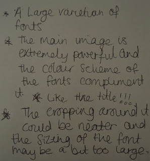
Peer Feedback

Here is some feedback I got from four members off my class, I got this feedback before my front cover was finished:


Something's that need to be improved is the cutting out of the shape off the image, this would make the whole thing neater and more complete. Also some things that need to be added such as minor details like the bar code and date/issue number. However some positive comments are the image is powerful and the color scheme compliments it, also the works well with the title.

Monday, 7 January 2013

Font Research

For my research into font details I decided to look into different types of fonts to see which one was most appropriate to use. I also looked into some magazines to see how many different types of fonts were used and what they were used.

Serif
Sans Serif

The type which does not have serifs the little extra strokes found at the end of the main vertical and horizontal strokes some letter forms are called sans serif (without serif)