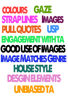
Like any magazine, such as Q and NME my front cover has a dominant photo which would be recognized by a reader, as this person is a 'famous singer' it is dominant yet simplistic and sophisticated as this would represent the style of the DPS. Which shows the life of a complicated star but someone with gratitude, I would like to think these two interlink with each other.
Also by the target audience recognizing the dominant image it gives them reason to buy the magazine. The mode of address would but the exclusiveness of some of the stories and what 'Ruby Red' has to offer is shown and portrayed through her strapline, this would again give the reader incentive to want to buy the magazine and reader on. These are all ways with engaging with the reader and my audience.
Although some magazines go for a different approach to attract their target audience, such as Kerrang! With the more messy approach, to fit in multiple images, although this works for them, as you can see the obvious reference to the fact it is a rock/indie magazine, by offering a lot of photos this would attract them as it has alot going on inside. I offered my readers an exclusive CD and two free downloads of singles on I-Tunes, this would be my Unique selling point to the reader. Again adding more reason to buy the magazine as it offers free gifts, and of course 25 photots all for a price of roughly £3.
The use of the word "exclusive" on the coverlines of my front page attracts my target audience because it shows that they will not get this featured story anywhere else. It makes the magazine unique as her fans would instantly want to buy this magazine as it wouldn't be featured anywhere else. Again this could be a promotion towards my magazine, as the artists chose my magazine to feature on.
Also to attract my target audience, I used a female artist on the front cover wearing clothing that was simplistic yet high street. This would attract the target audience because throughout all images there isn't a very wacky and expensive item of clothing, this therefore would be a link with the audeince showing a side to the magazine that relates to them as a buyer.
Although the images might not be that appealing to the male audience the color scheme was unbiased, as red appeals to both males and females. Also the use of bands that have been mentioned would again appeal to the male audience.
https://soundcloud.com/user38005795/memo-3/s-3jvm6?in=user38005795/sets/my-magazine/s-3jvm6


No comments:
Post a Comment